


I read a lot of tech blogs and news websites. On an average day I probably filter through around 20-30 articles to keep myself up to date. It’s something that has become a natural part of my day and is essential in some ways to staying current, especially in the world of AI. I’ve even gone as far as creating an open source article collection app so I don’t miss anything (but I’ll write about that another day).
Today though, something in my brain just flipped. This morning was like any other. I opened a newsletter and clicked a link. It wasn’t even a subject I was specifically interested in - an XDA article about Docker containers - but I was skimming it for anything new that I could learn. But then I found myself engaged in a visual battle just trying to read the article.
Maybe I hadn’t had enough morning caffeine, but all I could see was adverts, an unrelated news video, shopping recommendations and links to other stories. Somewhere among them was the article I wanted to read but I could barely find it. I was really struggling to focus on it, and the more I scrolled the more frustrated I became.
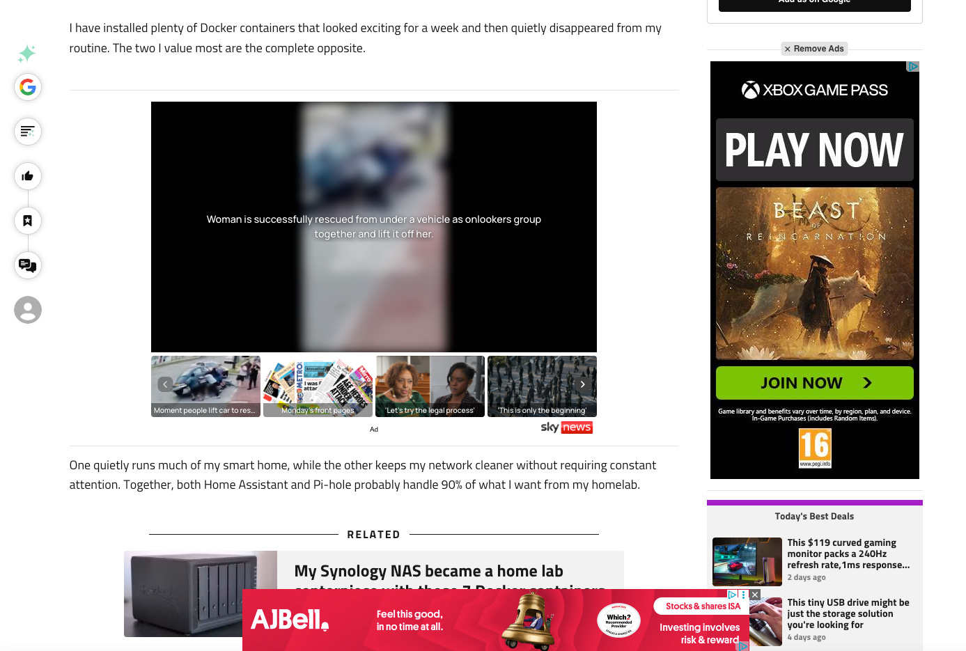
And then every article I clicked after that compounded the annoyance. Shutting down and rejecting cookie notices. Scrolling past enormous header images. Shutting down annoying pop-up videos or trying to find the mute button. Attempts to shrink adverts at the bottom of the screen with annoying little close buttons, only resulted in accidentally clicking on the ad I was trying to avoid. One after the other. Pounding away at my patience like endless whack-a-mole.
Just let
Me
Read
THE ARTICLE!
This is nothing new of course. These frustrations have been around for well over a decade. It’s what products like Adblocker were created for - although they’re rarely effective. I think I’ve just become numb to the entire thing, and accepted it as the norm.
I remember listening to a talk at a web design conference in 2009 about usability and the frustrations of pop-ups. Everyone in the audience listened intently, laughed and grimaced through examples, then universally agreed that they would go away and try to make the internet a little bit better.
We failed.
Of course I get it. Ad revenue pays the bills. But marketing execs have forgotten that the reason why users actually return to websites is for the content, not the advertising noise. Nobody is jumping up and down because they’ve just seen an advert for Temu that’s rocked their world. By building in so many adverts web owners are actually reducing their chances of return visits.
So when the caffeine kicked in and this morning’s headache had subsided, I decided to run a little experiment. The hypothesis - how much of a typical tech website’s reading view is actually available for reading?
I say “I”, but in all honesty I should’ve said “AI”. I’m not bonkers (or wealthy) enough to spend hours trawling through websites and counting pixels. I had GPT-6 Astra do it for me.
I set out to compare article snapshots from eight technology publications - seven of the top 10 tech blogs in the world and XDA, the site that triggered this frustration in the first place. For the top seven, I asked GPT-6 (ultra if anyone’s vaguely interested) to select the first featured editorial article on each homepage. For XDA, I used the Docker article that set me off down this rabbit hole in the first place.
Working on the assumption that most of the blogs tend to have a trendy large header image, I requested that the snapshot began at the article’s first significant opening text. I wanted to look at general article readability. I requested for navigation and empty space to be disregarded, grouped adverts and self-promotion together as one (just to simplify the statistic), and counted supporting images/video relevant to the article separately.
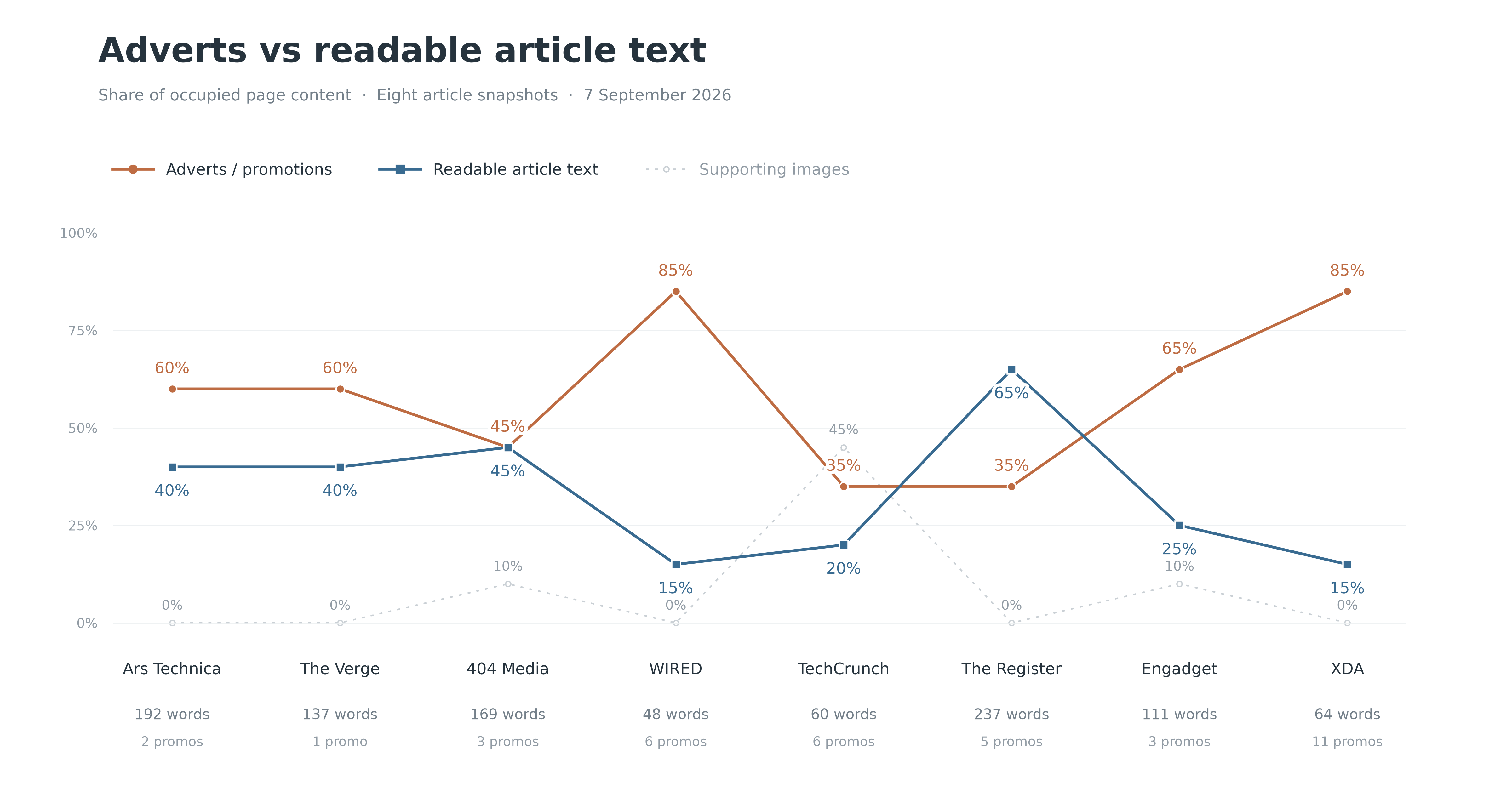
The Register devoted the largest share to readable text: 65%, containing 237 visible words. The average person reads 238 words per minute - so the article had presented pretty much bang on a full minute’s worth of reading material. I know this doesn’t sound a lot, but from a digital engagement perspective that’s pretty impressive. Its promotional space only consisted of related-story recommendations, with no separate display advert visible. Big win for The Register.
At the other end of the spectrum, WIRED and XDA devoted approximately 85% of their pages to adverts and promotion. Their snapshots contained 48 and 64 readable article words respectively. Frankly that’s rubbish. Apparently the average sentence in the English language is 12-15 words. So on average in an article on a top rated tech website you’re only getting to see 3-5 sentences of actual text…and the rest is adverts.
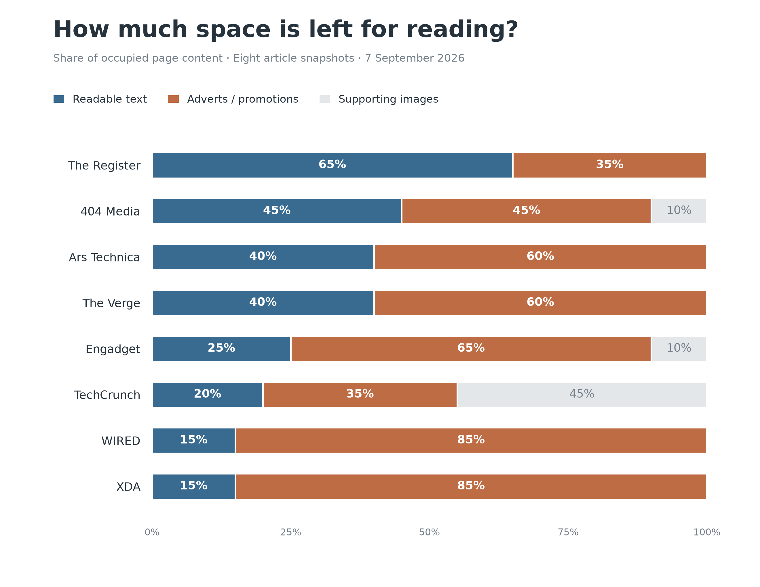
The best website devoted two thirds of its screen real estate to readable article content. And the worst devoted only 15% of its estate to the actual thing you came to read. It makes me feel a little better about taking the time to look into this - it’s not just pre-caffeinated me, it’s actually bloody terrible.
Consider this in the context of watching your favourite hour-long TV show. 15% would be like sitting down for an hour, and then being forced to watch two minutes of adverts every 21 seconds.
9 minutes of Ted Lasso1. 51 minutes of adverts.
Let that sink in for a second. I did the maths on it way too many times. It’s shocking.
Do I even need to show the obligatory pint of beer and bar of chocolate comparison? Really? Oh go on then.

Now obviously this was an illustrative snapshot test, nothing particularly scientific. But it proved the point and reduced my annoyance by around 70%2. So next time you find yourself shutting down adverts and straining for content, ask yourself this, was this website really worth my time and effort? Because perhaps the best way to illustrate your frustration is by sourcing your news elsewhere.
Desperate attempt to find other people quietly obsessed with Ted Lasso
Completely made up statistic