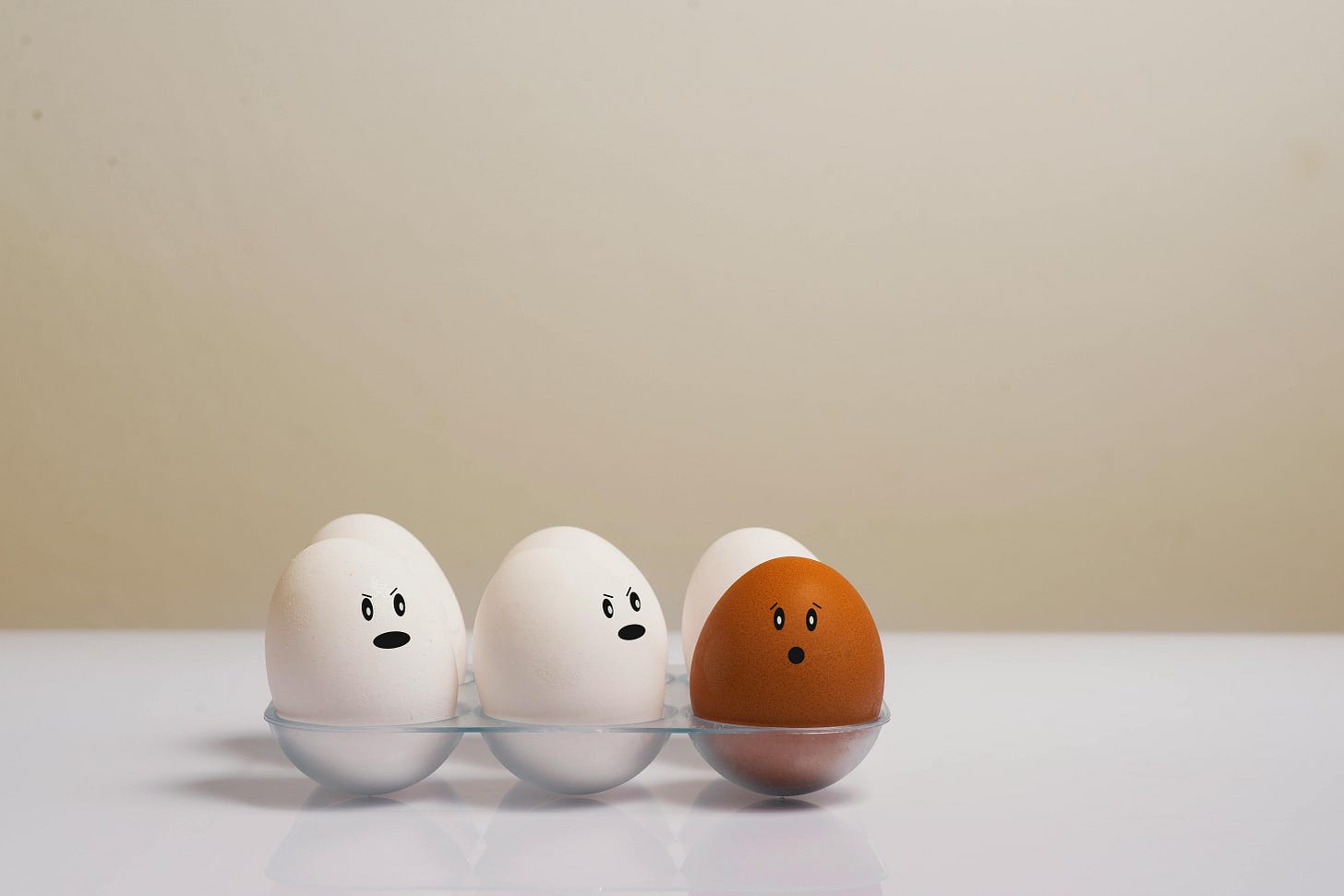
When did Digital start feeling so… Generic?
(Or: How we flattened the web in the name of Best Practice)

I clicked through three different cultural websites last week – and honestly, I couldn’t tell you which was which. Same layout. Same nav. Same polite welcome message in 16px grey. A homepage carousel shuffling through upcoming events, a big hero banner with barely enough contrast, and maybe – if they were feeling wild – an animated gradient on the newsletter signup.
Somewhere along the way, we streamlined our way into a kind of polite digital beige.
And to be fair, I get it. Templates make things quicker. Frameworks keep things consistent. Design systems reduce risk. These are sensible things. Responsible, even. Especially if you’re working in the public sector, or with tight budgets, or juggling five stakeholders and a CMS that’s allergic to creativity.
But still. I miss the weirdness.
I’m not talking about spinning logos and Comic Sans footers (although, let’s be honest, a few of those old sites were oddly joyful). I’m talking about a certain... texture. Personality. That feeling you’d get from stumbling across a page that didn’t quite behave, but made you smile anyway. Where someone clearly tried something. Even if it broke a bit in Netscape.
Now, so many digital experiences – especially the worthy ones – feel like they’ve been pressed from the same mould. Accessible. Responsive. Usable. But somehow lacking presence. No quirks, no surprises, no real sense of the people behind the pixels.
It’s not that standardisation is bad. Quite the opposite – shared patterns and practices help level the playing field. Accessibility especially benefits from that consistency, and it’s more achievable than ever. Performance can be baked in from the start. And design systems can empower teams instead of boxing them in – when done well.
But accessibility doesn’t mean things have to be boring. You can still be creative – and still be inclusive.
But I do worry that in chasing best practice, we’ve started filtering out personality by default. Because it’s safer. Less effort. Less debate. More “efficient.”
What gets lost in that trade is subtle but cumulative. Interfaces that feel sterile. Content that’s polite but bloodless. A digital presence that ticks all the right boxes but doesn’t leave a mark.
Maybe it’s time we brought back a bit of bravery.
Not wholesale reinvention – no one’s asking for dancing hamsters to make a comeback. But small things. A bolder colour choice. A playful heading. A layout that breaks rhythm on purpose. Moments of warmth or mischief or humanity that remind you this wasn’t made by a committee of robots.
There’s still room for originality, even inside a framework. There’s still space for craft, even on a deadline. It just takes a team that values it – or maybe just someone brave enough to ask “does it have to look like this?”
Written by Stu Collett – web veteran & recovering perfectionist.
Enjoying The Byte Stuff? You can subscribe for free to get future posts by email – no spam, no pressure, just occasional digital reflections.

